 About us
 Services
 Projects
 Blogs
Blogs


Introduction:
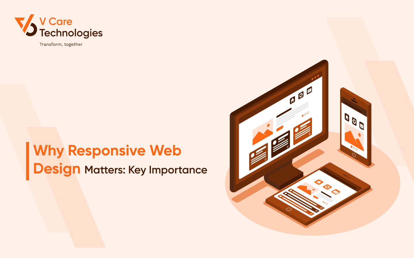
In a digital landscape where diverse devices have become an integral part of our lives, the importance of a seamless online experience cannot be overstated. This is where responsive web design steps in as the hero of modern web development. In this article, we embark on a journey to unravel the pivotal significance of responsive web design, shedding light on its impact, implementation, and undeniable importance.
What is Responsive Web Design
At its core, responsive web design is an approach that allows websites to adapt their layout and content based on the screen size and orientation of the device being used. This means that whether a user accesses a website on a desktop, tablet, or smartphone, the website's elements adjust seamlessly to provide an optimal viewing experience.
The Purpose of Making Your Design Responsive
The purpose of responsive web design is crystal clear: enhancing user experience across the board. In an era where users access websites from various devices, failing to provide a consistent and user-friendly experience can lead to high bounce rates and lost conversions. Responsive design ensures that your content remains accessible and visually appealing, regardless of the device it's viewed on.
What Does it Mean for a Website to be Responsive?
When a website is responsive, it means that it can detect and adapt to the user's device characteristics. The layout, images, and text adjust proportionally to fit the screen, providing an optimized browsing experience. This adaptability ensures that users can navigate your website without the frustration of having to zoom in, pan, or scroll excessively.
Responsive UI: A Key Ingredient for Success
Responsive web design goes beyond aesthetics; it involves creating a user interface (UI) that's intuitive and functional across devices. Buttons should be easy to tap, menus should be accessible, and text should remain readable. An effective responsive UI enhances user engagement and ensures that interactions are smooth and frustration-free.
How is Responsive Web Design Implemented?
Responsive web design is implemented through techniques such as CSS media queries and flexible grids. Media queries allow the website to apply different styles based on the device's characteristics, while flexible grids ensure that elements adjust proportionally. The combination of these techniques results in a fluid and adaptable design.
Mobile Responsive Website: Catering to Mobile Users
A mobile responsive website is designed with mobile users in mind. With the increasing prevalence of smartphone usage, catering to mobile users has become imperative. A mobile responsive site ensures that content is easily readable, buttons are easily tappable, and the overall experience is optimized for on-the-go interactions.
Mobile First Responsive Web Design: A Strategic Approach
Mobile first" design is a strategic approach that involves designing the mobile version of a website before tackling the desktop version. This approach prioritizes essential content and ensures that it's optimized for smaller screens. It not only results in a better mobile experience but also encourages a more focused and streamlined design overall.
Best Screen Sizes for Responsive Web Design
Choosing the right screen sizes to target is crucial for effective responsive web design. Common breakpoints include 320px (smartphones), 768px (tablets), and 1024px (small laptops). These breakpoints ensure that your design adapts smoothly to a range of devices, offering a consistent experience.
Responsive and Adaptive Design: Different Approaches
These designs are often used interchangeably, but they have distinct differences. Responsive design uses fluid grids and media queries to adjust the layout, while adaptive design involves creating fixed layouts for specific devices. Both approaches have their merits, but responsive design is more flexible and generally easier to implement.
Responsive Web Application: Beyond Traditional Websites
Responsive web design isn't limited to websites; it's equally important for web applications. Whether it's an e-commerce platform, a productivity tool, or a social media app, users expect a seamless experience. A responsive web application adapts to various devices, ensuring usability and accessibility.
Responsive Landing Page: Captivating First Impressions
Landing pages are often the first point of contact between users and your website. A responsive landing page ensures that this initial interaction is engaging, regardless of the device. Whether you're promoting a product, event, or service, a responsive landing page can significantly impact user engagement and conversion rates.
Mobile Friendly Website Design: User-Centric Approach
Creating a mobile-friendly website goes beyond responsiveness—it's about delivering a user-centric experience. Fast load times, clear content hierarchy, and easy navigation are all hallmarks of a mobile-friendly design. When users can effortlessly achieve their goals on your website, they're more likely to stay and explore.
Responsive Website Development Company: Your Partner in Success
Implementing responsive web design can be complex, but enlisting the help of a responsive website development company can make the process smoother. These experts understand the nuances of coding, design, and user experience, ensuring that your website not only looks great but functions seamlessly across devices.
The Continuous Evolution of Responsive Design
Responsive web design is not a one-time task; it's an ongoing process. As new devices and screen sizes emerge, staying up to date with responsive design practices is essential. Embracing this evolution ensures that your website remains relevant, user-friendly, and future-proof.
Embracing the User-Centric Approach
Responsive web design is, at its core, a user-centric approach. It's about putting the user's needs and expectations at the forefront of design decisions. When your website seamlessly adjusts to their devices, users feel valued and understood. This not only enhances their experience but also builds trust in your brand. By prioritizing their convenience, you're laying the foundation for a lasting and positive relationship.
The SEO Advantage of Responsive Design
Search engines appreciate responsive web design as much as users do. Google, for instance, considers mobile-friendliness as a ranking factor. A responsive website that provides a smooth experience across devices is more likely to rank higher in search results. Additionally, with a single URL for all devices, you avoid duplicate content issues and facilitate easier indexing by search engines.
Overcoming the Challenges of Responsive Design
While responsive design brings a plethora of benefits, it's not without its challenges. Ensuring consistent performance across devices, dealing with varying screen resolutions, and optimizing images for different sizes can be demanding. However, these challenges are worth overcoming for the enhanced user experience and long-term benefits that responsive design offers.
The Era of Adaptive Web Design
In the realm of responsive web design, another term often surfaces: adaptive web design. Unlike responsive design's fluid approach, adaptive design involves creating separate layouts for different devices. While it offers more control over user experiences on specific devices, it can be complex to implement and may not be as versatile as true responsive design.
User Expectations and the Bar of Excellence
User expectations are continuously evolving, and responsive web design is a crucial tool for meeting these expectations. Users don't differentiate between devices; they expect a seamless experience regardless of whether they're on a smartphone or a desktop. By embracing responsive design, you're setting the bar of excellence high and ensuring that your website stands out in a competitive digital landscape.
The Impact on User Engagement and Conversion Rates
User engagement and conversion rates are intrinsically tied to user experience. A website that's easy to navigate and visually appealing encourages users to explore further, increasing engagement. Moreover, when users find what they're looking for without hassle, they're more likely to convert into customers, subscribers, or whatever your desired goal may be.
The Aesthetics of Responsiveness
Responsive design isn't just about functionality; it's about aesthetics too. A design that adjusts elegantly to different screens showcases a level of professionalism that resonates with users. Imagine the impression created when a user switches from a laptop to a smartphone and finds that your website remains polished and inviting. It's a testament to your dedication to providing a top-notch experience.
The Role of Testing in Responsive Design
Testing is a crucial phase in responsive web design. With the multitude of devices and screen sizes available, ensuring consistent performance requires rigorous testing. This includes checking layout adjustments, verifying font readability, testing interactive elements, and confirming that media displays correctly. Thorough testing guarantees that your design maintains its integrity across the board.
Accessibility and Inclusivity
Responsive web design isn't solely about accommodating different devices; it's also about ensuring accessibility and inclusivity. Users with disabilities use a variety of devices, and a responsive design that caters to their needs fosters an inclusive digital environment. By making your website accessible to everyone, you're not only complying with regulations but also enriching the online experience for all users.
The Collaborative Effort of Responsive Design
Responsive web design is a collaborative effort that involves designers, developers, and content creators working in harmony. It's about understanding the needs of each element and ensuring they seamlessly come together. When these teams collaborate effectively, the result is a harmonious and user-friendly website that effectively communicates your message.
The Human-Centered Approach of Responsive Design
At its core, responsive web design is a human-centered approach. It acknowledges the diverse ways in which humans interact with technology. Whether they're swiping on a smartphone, clicking on a tablet, or typing on a keyboard, responsive design adapts to these interactions, creating a digital experience that feels tailor-made for each user.
Future-Proofing Your Online Presence
One of the most remarkable aspects of responsive web design is its future-proofing capabilities. As new devices enter the market, you're equipped to meet them head-on. Instead of scrambling to redesign for each new device, responsive design allows your website to evolve with the digital landscape, saving you time, effort, and resources.
The Collaborative Power of Responsive Design Teams
Creating a responsive website requires a collaborative effort from various teams. Designers, developers, and marketers need to align their goals to ensure that the website not only looks great but functions seamlessly and meets business objectives. The synergy between these teams results in a website that strikes the perfect balance between form and function.
The Human Element in the Digital Realm
Responsive design bridges the gap between the digital and the human. It transforms the online experience from a mechanical transaction to a human interaction. By anticipating user needs and adapting to their behavior, responsive design creates a dynamic and empathetic digital space that reflects the genuine essence of human interaction.
Conclusion: Navigating the Digital Landscape with Responsive Web Design
As we navigate the ever-evolving digital landscape, responsive web design emerges as an essential tool for creating meaningful connections with users. From adapting to diverse devices to prioritizing user needs, responsive design transcends trends and establishes itself as a cornerstone of modern web development. By embracing the power of adaptability and user-centricity, you're not only enhancing user experience but also future-proofing your digital presence. So, as you embark on your web design journey, remember: responsive design isn't just a choice; it's a commitment to creating an inclusive, engaging, and impactful online realm.
Choose V Care Technologies as your partner in web design excellence! Our team is dedicated to creating responsive, user-centric, and future-proof websites that will set your online presence apart. Let's craft a digital experience that resonates with your audience. Contact us today for the best web design services in Surat!