About us
 Services
 Projects
 Blogs
Blogs


Dashboard shows: 847 orders today.
Manager stares at it.
Is 847 good? Bad? Normal? Alarming?
He doesn't know. He needs to check last week's numbers.
Compare mentally. Calculate percentage change.
By the time he figures out 847 is 23% below normal and
there's a problem, it's been 2 hours.
The dashboard showed the data. It didn't show the meaning.
The Numbers Problem
Raw numbers require interpretation.
"23 pending tasks" - Is that normal or a
backlog crisis?
"94% delivery rate" - Is that good or below
target?
"₹4.2 lakhs revenue" - Celebrating or
panicking?
Without context, numbers are just numbers. The human brain
has to do the work of:
- Remembering
what "normal" is
- Comparing
to targets
- Calculating
deviations
- Deciding
if action is needed
This mental work takes time. And humans are inconsistent at
it, especially when tired or distracted.
What Visual Status Adds
Visual indicators do the interpretation for you:
Color coding:
- Green:
On target, healthy, no action needed
- Yellow/Orange:
Warning, approaching problem, attention needed
- Red:
Problem, below target, action required
Icons and symbols:
- ↑
Trending up
- ↓
Trending down
- ✓ Complete/Good
- ⚠ Warning
- ✗ Problem
Progress indicators:
- Bars
showing percentage toward target
- Gauges
showing current vs. acceptable range
- Sparklines
showing trend over time
With these additions, a manager glances at the dashboard and
instantly knows: "Red on delivery rate. Problem. Look into it."
No mental math. No comparison to last week. Instant
understanding.
The 3-Second Test
Good status design passes the 3-second test:
A manager glances at the screen for 3 seconds.
They should immediately know:
- What
needs attention (red items)
- What's
fine (green items)
- What's
trending concerning (yellow items)
If they need more than 3 seconds to understand the status,
the visualization is failing.
Numbers are for detailed analysis. Colors and icons are for
instant understanding.
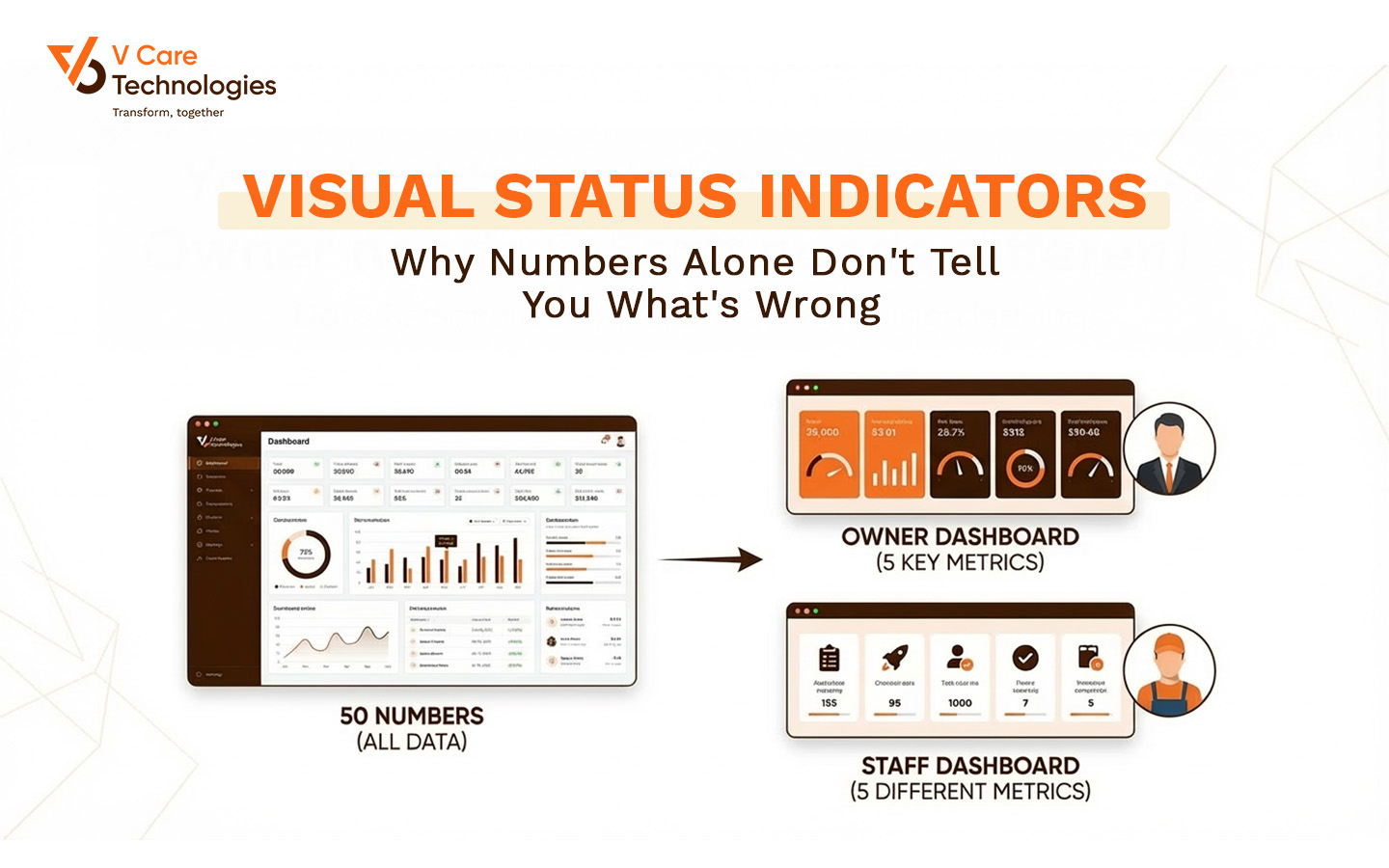
A Real Scenario
A logistics company dashboard showed 15 numbers: orders,
deliveries, returns, pending, delays, etc.
Managers would look at it and say: "I don't know what
I'm looking at."
They'd export to Excel. Create their own comparisons. Make
their own red/yellow/green highlights.
The dashboard became a data source, not a decision tool.
Redesign added:
- Color-coded
cards: Green if metric is healthy, red if concerning
- Comparison
arrows: ↑12% vs yesterday (green) or ↓8% vs target (red)
- Exception
highlighting: Only problematic items draw attention
- Threshold-based
alerts: Automatic color change when metrics cross defined boundaries
Result: Managers now spot problems in seconds instead of
minutes. The dashboard became a decision tool again.
Setting the Right Thresholds
Visual status is only as good as its thresholds.
Define clear boundaries:
- Green:
Above 95% delivery rate
- Yellow:
90-95% delivery rate
- Red:
Below 90% delivery rate
Make thresholds adjustable: What's "good"
changes over time. Allow easy threshold adjustment.
Don't over-alert: If everything is always yellow or
red, the colors lose meaning. Reserve red for genuine problems.
Consider direction: 92% that was 88% yesterday
(improving) is different from 92% that was 97% yesterday (declining).
Common Mistakes
Too many colors: Red, orange, yellow, lime, green,
teal, blue... confusion. Stick to 3-4 states maximum.
Color as only indicator: Color-blind users can't
distinguish red/green. Add icons or patterns as secondary indicators.
Static thresholds for seasonal data: 500 orders might
be great in slow season and terrible in peak. Context matters.
No explanation of colors: Users should know what
triggers red vs. green. Make the logic visible.
Everything is urgent: If every metric is red, nothing
is red. Prioritize what truly matters.
Key Takeaways
- Raw
numbers require mental interpretation - slow and inconsistent
- Visual
status (color, icons, trends) provides instant understanding
- The
3-second test: Can you understand status at a glance?
- Set
clear thresholds for what triggers each status level
- Don't
over-alert - reserve red for genuine problems
The Bottom Line
Your dashboard shows data. That's not enough.
Managers don't need to know the numbers. They need to know:
"Is something wrong? Where? How urgent?"
Color coding, icons, and visual indicators answer these
questions instantly.
Stop making humans do interpretation work. Let the design do
it.
Show meaning, not just
numbers.