About us
 Services
 Projects
 Blogs
Blogs


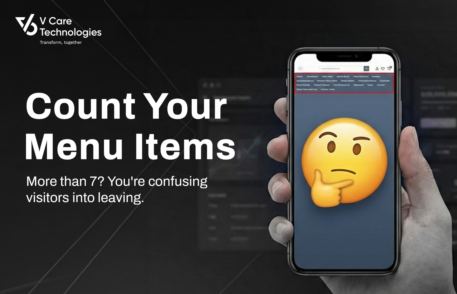
The Menu That Made Everyone Leave
Picture yourself at a restaurant with a 47-page menu. Every
cuisine imaginable. Hundreds of dishes. Every dish sounds good. But after
flipping through pages for ten minutes, you're exhausted and no closer to
deciding. You might even leave.
This is what happens when websites overwhelm visitors with
navigation options.
A manufacturing company proudly displayed their
comprehensive website. Fifteen product categories in the main navigation. Each
category had subcategories. The homepage had banners for promotions, industry
news, company announcements, CSR initiatives, and investor relations.
The result? Visitors couldn't find anything. Analytics
showed users clicking random menu items, going back, clicking different items,
going back again. Heat maps showed scattered attention across the screen with
no clear flow.
The website had everything. And that was exactly the
problem.
The Science Behind Navigation Confusion
Cognitive load theory explains why too many options paralyze
decisions. Human working memory can hold approximately 7 items (plus or minus
2) at once. When presented with more options, the brain struggles to evaluate
them all and often defaults to the easiest decision: leaving.
This isn't about intelligence. It's about how human
attention works. Every additional menu item competes for attention. Every
option demands mental evaluation. Every click requires a decision.
When your navigation offers 12 or 15 options, visitors must
evaluate each one to decide where to go. This takes mental energy. And visitors
who arrived with a simple goal - "find contact number" or "see
products" - shouldn't need to spend cognitive resources on navigation
itself.
The Rule of 7 in Practice
Primary navigation should contain a maximum of 7 items.
These should represent the most important destinations for your most common
visitors.
Think about who visits your website and what they want. A
manufacturing company's visitors likely want: Products, Industries Served,
About, and Contact. That's 4 primary items. Maybe add Resources and Careers.
Still under 7.
Everything else can live elsewhere. Secondary pages go in
footer navigation. Tertiary pages go within parent sections. Rarely accessed
pages don't need navigation prominence at all.
The discipline of limiting navigation forces clarity about
what matters. If you can't fit everything in 7 items, you haven't clarified
your priorities yet.
Where Everything Else Lives
Dropdown menus handle subcategories within primary items. A
"Products" navigation item can expand to show 10 categories without
cluttering the main navigation bar. The cognitive load stays manageable because
users only see subcategories when they've already expressed interest in
products.
Footer navigation accommodates secondary links. Legal pages,
privacy policies, sitemaps, careers, media resources - these serve important
functions without deserving primary navigation placement.
Internal links within pages guide visitors deeper. A
well-structured product page can link to related products, case studies, and
technical documents without adding to main navigation.
The goal isn't removing access to pages. It's removing
obstacles to finding what matters most.
The Manufacturing Company Solution
That company with 15 product categories restructured their
navigation completely.
Primary menu reduced to: Products | Industries |
Capabilities | Resources | About | Contact
"Products" dropdown showed 5 main categories with
"View All Products" at the bottom leading to a comprehensive product
finder page.
The homepage simplified to one clear path: primary hero
banner, three featured capabilities, testimonial, and contact form.
Analytics showed immediate improvement. Time on site increased.
Bounce rate decreased. And critically, contact form submissions doubled within
two months.
Less navigation led to more action.
How To Audit Your Navigation
Count your primary navigation items right now. If it's more
than 7, you have work to do.
Next, review each item. Ask: "If a first-time visitor
saw only this word, would they know where it leads?" Items like
"Solutions" or "Resources" often confuse more than clarify.
Then check your analytics. Which navigation items get
clicked most? Which are rarely touched? Rarely-clicked items are candidates for
demotion to footer or removal entirely.
Finally, test with someone unfamiliar with your business.
Ask them to find specific information. Watch where they struggle. Their
confusion reveals navigation problems.
Key Takeaways
- Human
working memory handles approximately 7 items - exceed this and visitors
struggle to decide
- Primary
navigation should contain maximum 7 items representing the most common
visitor goals
- Secondary
content lives in dropdowns, footers, and internal page links
- Analytics
reveal which navigation items matter and which create noise
The Bottom Line
Every item in your navigation is a demand on
visitor attention. Every option is a decision you're asking them to make. When
you offer 12 possibilities, you're asking visitors to evaluate 12 decisions
before they've even started their actual task. The goal of navigation isn't to
show everything your website contains. It's to guide visitors toward what they
came for. Count your menu items today. If the number exceeds 7, start asking
which options deserve prominence and which are just adding noise.